Good morning!!!!! I am SO excited to finally share the launch of my new website and brand. This project has been in the works for quite some time, filled with late nights, and countless revisions and updates. Seeing it come together has been so rewarding, and I could not be more thrilled with how it’s all turned out. I’ve realized more than ever that good things take time, and I wanted to ensure it was absolutely perfect before sharing it with all of you.
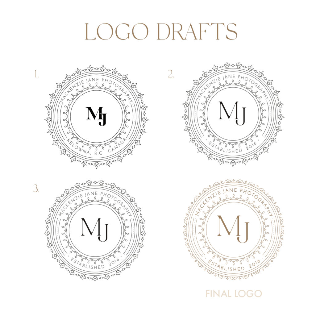
Along with today’s big reveal, I’m going to share some of the process of how we ended up at the final website and logo design. Seeing behind-the-scenes of how concepts evolve and develop is so interesting to me, so I figured I’d take you along through some of the initial drafts!
WEBSITE
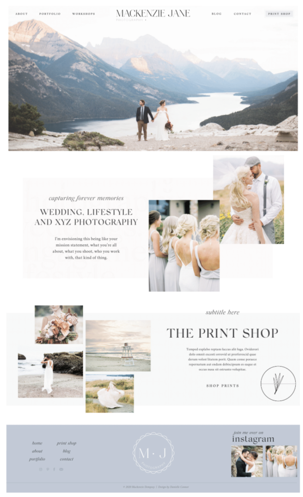
I worked with Danielle Connor on the website design and couldn’t be more excited with how it turned out. The site feels so *me*, and is so much more than I imagined when we first started drafting it. Danielle did such a fantastic job setting up the structure and initial template of the website, introducing and laying out different graphic design elements and typography that I’m not experienced with. From there, I was easily able to go in and play around with the layout. As an extremely tactile and visual person, I love the ability to make adjustments to my website without having to learn code. I’m able to do any tweaks I need to hands on, and found the platform extremely easy to use.
Danielle has been so wonderful to work with and extremely talented in website and graphic design. If you’re looking for a new website, she is selling templates (one of which is inspired by this new site!) You can check out Danielle’s work here.

BRANDING
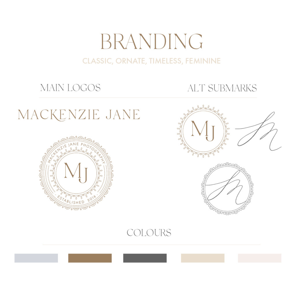
When it came to conceptualizing my brand and website, I was pressed to come up with words and inspiration that would most accurately describe my business and personal style. Conveying that through colours, logos, and imagery can be a challenge, and I wanted to ensure that my content best emulated who I am and how I run my business. Some of these words included classic, bright, and fresh, but ultimately, the expression I kept circling back to was timeless. At the heart of my photography and lifestyle, quality and timelessness are at the forefront. I want my clients to look back on their photos 20, 30, 40 years down the road and fall even more in love with them. When I make personal purchases, I invest in things that will stand the test of time. The values I exude and the way I live my life is also the way I photograph, and I wanted all of this to be reflected in my company’s identity.
My photography and editing style is largely inspired by classic film photography, and my desire was to carry this mindset throughout the design process. There are so many elements that encompass a brand, including colours, fonts, logos, submarks and graphics. When pulling inspiration for my new logo, I was drawn towards classic typography with unique elements and features. I also found many of the logos I was loving were quite ornate, featuring intricate details, and almost resembling old stamps. While I knew that I desired a classic logo, I also wanted one that had distinguished, artistic features, and one that looked different from anything I’d seen before.
I worked with Pam from Pam & Paper on the design of my logo. I’ve known Pam almost my entire life – she’s an artist and graphic designer who’s so incredibly talented in her craft. I was so excited to work with her, knowing she would create something artistic and unique.
For the main logo featured on the top of my home page, I envisioned a logo that was understated, simple and clean. Sitting at the top of the main home page, it was important to me that it wasn’t too busy, since the photo underneath was such a statement. We added a swoop underneath the ‘K’, which gave it a really feminine flair to my written name that I absolutely adore.

CIRCLE LOGO
When Pam sent through the first submark drafts, she presented a variety of different options that were all quite different in style. The circle option from the inital iterations immediately caught my eye, and I knew that it would be the design I’d move forward with. What I love most about the circle logo was without a doubt the intricate outer circle layers. We didn’t change much of that part of it throughout the design process, instead simply tweaking the MJ in the middle (matching it to the same font as the main logo), and adjusting the outermost layer so that it had a floral feel. I love that she added little diamonds in between each of the scalloped flowers, so that it still had some edginess and strength to it.
Determining the colour of the main logo and submark proved to be quite challenging. I knew that I wanted a gold logo – I have a supreme love for gold jewelry that I wear on a daily basis, and it also ties into keeping with a timeless, elegant vibe. Finding a gold colour that worked well for the submark was difficult – most of the ‘gold’ shades we were swatching pulled quite green, or simply looked like a dark brown. We sampled a LOT of different shades, and finally landed on one that I believe is the truest ‘gold’.
The final logo turned out perfectly, and is exactly what I wanted (and more!) when I was first conceptualizing it. Pam created a logo that epitomizes my style and aesthetic, mixing in classic elements with intricate detail that make it sophisticated and polished.

I’d love to know what you guys think of my new website and branding! Are you as inspired by beautiful branding as I am?!
Xx
Mackenzie
Leave a Reply Cancel reply
about
portfolio
shop photos
blog
contact
join me over on
© 2020 Mackenzie Dempsey | Template by Danielle Connor

Congratulations Mackenzie. I was first introduced to you while following Team Jilly and fell completely in love with your style and photography! As someone who also loves capturing moments your story is very inspiring! Beautiful new website, I can’t wait to watch it grow!
Eeek absolutely love it! I’m just in the process of revamping and establishing branding for myself and this makes me so excited to get to the final product